| Contact |
Jill Willis
|
|---|
Art + Design Professor, Benjamin Gross, will be opening a Solo Art Exhibition titled, “Underlying Meanings,” in the Winfisky Gallery this February. The exhibition features 35 of Professor Gross’ own prints worked on over the course of a five-month sabbatical as well as the following summer. The Center for Research and Creative Activities was able to interview Professor Gross and gain more insight as to how the exhibition came about.
If you are interested in viewing the gallery there will be an Artist Talk Wednesday, February 9 at 12:30 PM over Zoom and two receptions. One will be February 9 from 1:30 to 3:00 PM and Wednesday, February 16 from 6:00 to 8:30 PM.
[CRCA] How did the idea for the “Underlying Meanings,” exhibition come about?
[Gross] For my first two sabbaticals (2005 and 2014) I created two large series of serigraphs that were focused on figurative portraiture. They were entitled “Familiar Faces” and “Selective Smiles”. Each series of prints had background narratives that paralleled the visual compositions.
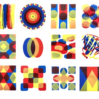
Since my last sabbatical in 2014, I started investigating both nonobjective and figural/representational subject matter. It enabled me to intertwine printmaking and color theory which has been an exciting tangent for my portfolio and pedagogically linked to my teaching (I teach color and design and all forms of printmaking). The exhibition includes my “Underlying Meanings” series of 12 editions of prints, “Mini Meanings” series of 18 editions, and some figurative work as well (three large multicolored “surfing” prints and a black and white portrait).
“Underlying Meanings” is a combination of abstract compositions that use color theory (primary / secondary colors) to create the illusion of transparency and color mixing. The non-objective compositions illustrate how humans perceive color and the visual effects of how overlapping colors mix, balance, or contrast with each other. For example, my serigraph “Well Rounded” incorporates the literal definition of integrating a smooth and or curved shape. But it also conveys secondary and tertiary translations of being pleasurably varied and balanced.
My artwork allows the viewer to find parallels between the abstract subject matter and their own experience/perception. A comparison can then be constructed through the infused titles and compositions that are interpreted. The “Mini Meanings” series is an offshoot of my "Underlying Meanings' series of prints. In addition to prints with primary and secondary colors, “Mini Meanings” includes designs that also incorporate varied color schemes. The figurative work is expressive, bold, colorful, and or guided by representational subject matter.
[CRCA] How long did it take to complete the pieces in the exhibition?
[Gross] I had my sabbatical from January through May 2021 but I also extended some of my printmaking into the summer.
[CRCA] Is there a specific material that's integral to your work? Or specific materials used to create the pieces?
[Gross] I used traditional and contemporary serigraphy (screen printing) techniques in all but one print (relief print).
Here is some background information on the process of serigraphy. Of all the printmaking processes in use today, serigraphy is one of the newest. Although, it does have its ancient origins. It is one of the most direct procedures for obtaining single or multi-color images. The screenprint is produced on a rectangular frame over which fine fabric, silk, polyester, nylon, Dacron, or organdy is stretched. The fabric is blocked out wherever unprinted areas are to appear, and acrylic based color is squeegeed through the open mesh of the fabric. This produces the image on the surface below.
I used hand-drawn, digitally filtered, and punch hole registered image formulations. The imagery was photographically stenciled onto screens for production. I used a photographic emulsion for all my stenciling. To prepare my screens for the direct photo process, a sensitized emulsion was coated directly on the screen fabric. After the photo emulsion was dry, the screen was exposed with light on an exposure unit. Wherever there was drawn or photographic imagery on the screen, the exposure light did not penetrate the emulsion. Wherever there was no image, the light penetrated and hardened the emulsion. During the washout process the unexposed emulsion in the image areas washed out, leaving them open and printable. The hardened areas served as a block-out.
All the preparatory work and printing was labor intensive, regimented, and complex. The image formulation, image application, and printing were entirely executed by me in the printmaking studio. It required the focused undivided attention that I received during my sabbatical leave. It enabled me to create extensively connected editions of new prints.
[CRCA] How many pieces of artwork will be displayed in the gallery?
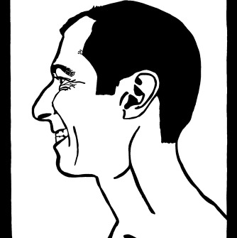
[Gross] There are 35 prints in the exhibit. 34 are serigraphs/screenprints and 1 is a divided block woodcut (relief print).
[CRCA] Do you have a favorite piece?
[Gross] Like my two children, I don’t have favorites! I love them equally for different reasons.
[CRCA] Is there anything about the artwork that you would like people to know before visiting the gallery?
[Gross] I love what I do and hope that my enthusiasm is shared by the viewer. This is my 25th year teaching at Salem State University and I feel that my artwork has evolved over those years. I cherish my time at SSU and I am excited about what the next 25 years will bring!