Adding, Resizing and Cropping Images
Adding Images
Content authors can add images to content in several ways. In some places, the images added will display in a fixed location with pre-defined sizing and/or pre-defined dimension. In other places, you can choose from some display options.
When you add an image, you will be asked to enter information like alternative text. In addition, our system collects other information about the image; e.g. the author, the time and date of upload, file size, and usage details. This collection is called a Media item. You will see your own list of Media items under "Select Existing" when adding an image or under "My Media" when looking at the "My Content" page.
File Size for accessibility
In addition to an image's height and width, its file size can also be reduced without losing quality. Reducing the file size can make it easier for people with slower internet connections load a page. An easy way to do this is using the online tool TinyPNG. Simply drag your image to the panda and it will downsize your file without changing is height or width.
Resizing and Cropping Images
When you upload an image, we store the original image and we automatically create additional versions of the image, depending on where the image is placed. This means that sometimes your image will be cropped in an awkward place. You may want to resize or crop your image yourself if you know that your original image has dimensions that differ from its display.
Windows
- On your windows machine, locate an image that is either JPG, GIF, or PNG
- Right-click the image → Open with → Photos
- Click the Edit image icon (looks like a pencil or sliders) at the top
- On Windows 10, crop is across the top and the rotate options are at the bottom.
- Select Crop & rotate
- Adjust the crop box as needed
- Click Save a copy or Save
Macintosh
- On your Mac, locate an image that is either JPG, GIF, or PNG
- By default, the image should open in Preview. If it does not:
Right-click the image → Open with → Preview.app - Click the Edit image icon (looks like a circle with a pencil tip facing up) at the top
- Either click Tools → Adjust Size
-- or --
Choose the Select tool (looks like a dotted square) at the top left, select an area, and click the crop button (looks like a diagonal piece of candy) at the end of the toolbar - Save a copy or Save
Best Practices
Helpful Hints for Working with Photos on the Web
- Remember to always follow the Writing Style Guide. You can find our Writing Style Guide on Polaris.
- Don’t forget photo permissions. You can find release forms in Polaris at Marketing and Creative Services How-Tos.
- Save a copy! If you have a great image that you’d like to use for the web, save a copy before you crop, resize or reduce it. You may want the original size image for something else.
- If you need to crop a photo, save the larger of the two dimensions (width or height) first. For example, if you have a 1200 x 800 image and you need it to be 1100 x 400 pixels, resize the image to 1100 pixels wide first. Then crop the photo to the appropriate height.
- Keep ratios locked. This means that if you change the width of an image, the height of the image will change accordingly. Otherwise, you can get skewed/stretched images. In “Preview” on a Mac, this feature is the “Scale Proportionally” checkbox. In MS Paint, this feature is the “Maintain aspect ratio” checkbox.
- It’s always better to size down than size up. Never size up. By trying to make a small image larger, you lose resolution, which can result in a blurry or pixelated image. If you have an image that you need to be larger, Marketing may have some images on file that meet your needs.
- Test your windows. You can resize your browser window to see how your page looks on a mobile device.
- Naming conventions. Use a naming convention that allows you manage you media easily. Do not use spaces or characters other than dashes and underscores.
- ALT Text. ADA compliance is required for published images. Add alternative text to an image that provides a clear description of what displays in the image. This text is read by assistive technology devices.
- Caption image. Different from ALT text, caption is used to identify who or what is displayed in an image.
Avoid images with too much text in them. For accessibility, images should not contain non-decorative text. Logos are okay because the design is decorative. But text that is intended to be read and to convey information is not okay in an image because:
- They cannot easily be accessed by assistive technology, such as screen readers or text-to-speech software.
- It's a bad experience on mobile (students predominantly use their phones to access web content).
- Low vision users may struggle with images of text: JPG and PNG images of text cannot be scaled up by users with low vision without becoming blurry.
- Any text that can be read by more modern OCR technologies on newer devices cannot differentiate headings from content from subtext.
- Text in images is invisible to our search tools and search engines.
When you have text in an image, the best practice is to:
- Copy the text from the image
- Paste the text into the webpage content's specific fields or content body
- Cut/crop the image to omit that text from the final image
If you MUST post a picture of a poster or flyer, you can include it in the content of the News or Event item, but not as a Featured or Listing Image. You will also need to include what the image is in the alt text and where the equivalent version of the details is located (e.g. “Event poster for Free Ice Cream Day, details in content”). The information within the image must also exist in the page content.
Image types
News, Events, and other content types on the WWW website have a variety of types of images with differing options.
News and Events
Featured Image | Listing Page Image | Content Images | Drumroll Images
Featured Image
The Featured Image displays on the News Item Detail pages and is the primary image when Featured. It will also display on the News Listing page if the Listing Page Image field is not used.
Vertical / Portrait / Square will crop vertical images to a vertical aspect ratio. It will crop horizontal images to a square.
Width: 607px, height variable.- Horizontal / Landscape will crop any image to a wide aspect ratio.
Width: 1080px, height variable.
Listing Page Image
This image displays on the News Listing Page only. If none is selected, the Featured Image will appear instead.
Width: 334px, height 335px.
Content Images
Images added into the content have 3 different display settings. Additionally, the alignment can be set to Left, Center, Right, and None.
- Inline - Square (400×400). Width: 400px, height 400px.
- Inline - Wide (600×400)
- Original size will offer no cropping or resizing but will not exceed the maximums of the page.
Drumroll Images (Supplemental images)
Images from Drumroll published items will appear below the content, squared to allow two per line.
Width: 334px, height 335px.
Image types
Carousel | Slideshow | Testimonial | The Latest | Feature - Full width | Feature - 2 columns | Feature - Two thirds | Feature - 3 columns | Video Feature | Impact | Numbers | Story Feature | Video Hero | Ambient Hero
Images uploaded should always be at least as large as the height and width specified.
All sizes and proportions are set programmatically by theme. All uploaded files will be cropped and resized.
Carousel |
|
|---|---|
Slideshow |
|
Testimonial |
|
The Latest |
|
Feature - Full width |
|
Feature - 2 columns |
|
Feature - Two thirds |
|
Feature - 3 columns |
|
Video Feature |
|
Impact |
|
Numbers | This complex content paragraph will display the background image scaled to fit it's display. Generally, width is 1.4 times the height. 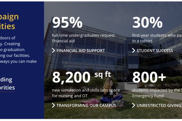
|
Story Feature |
|
Video Hero | The image will only appear if the video cannot be loaded. It will scale to fill the given space. 
|
Ambient Hero
| Example: Home page.
|
Grid (under development) |
|